If you want to learn the visualization using python in one place, then you’ll LOVE this guide.
Have you ever struggled to make sense of a large dataset? Data visualization can be your secret weapon!
Data visualization can help make sense of large, high-dimensional datasets and facilitate clearer understanding, particularly during the Exploratory Data Analysis (EDA) phase of a project.
When it comes to presenting final results to non-technical audiences, it’s important to be able to communicate findings in a concise and compelling manner.
By turning data into pictures, you can quickly and easily understand trends, patterns, and relationships in your data.
However, the process of setting up data, parameters, figures, and plotting can become cumbersome.
And with Python’s powerful data visualization libraries you do just that! It makes it easy to create visualizations, but the setup process can be a bit tricky.
In this blog post, we’ll show you how to use Matplotlib, Seaborn, and Plotly, three of the most popular Python libraries for data visualization, to create quick and easy visualizations that will help you extract insights from your data.
Don’t let a confusing dataset stand in the way of your understanding – learn how to visualize your data and unlock its full potential!
Whether you’re a beginner looking to get started with data visualization in Python or an experienced data scientist looking to add new tools to your toolkit, this tutorial has something for you.
Let’s get started with your favorite library,
Table of Contents
The database used for visualization
Here we used two Kaggle datasets for visualization using matplotlib library and used tips library for seaborn and Plotly libraries.
1. Chocolate bar ratings 2022 Database
The dataset used here is scraped from the flavor of cacao. This contains the chocolate reviews between 2006 and 2022.
There are ten columns in the dataset as follows:
- REF (reference number). The highest REF numbers were the last entries made. They are not unique values
- Company name or manufacturer
- Company location (Country)
- Date of review of the chocolate ratings
- Origin of bean (Country)
- Specific bean origin or bar name
- Cocoa percent
- Ingredients: Represents the number of ingredients in the chocolate; B = Beans, S = Sugar, S* = Sweetener other than white cane or beet sugar, C = Cocoa Butter, V = Vanilla, L = Lecithin, Sa = Salt)
- Most memorable characteristics
- Rating: The ratings are between 1 and 5, where 5 is considered the highest and 1 is the lowest.
You can download the chocolate bar rating database from here.
import pandas as pd

# reading the database
df = pd.read_csv("chocolate_bar_ratings.csv")

# printing the first 5 rows
df.head()
2. Alcohol Consumption around the World
This data is collected from World Health Organisation(WHO) and Global Information System on Alcohol and Health (GISAH).
There are ten columns in the dataset as follows:
- country
- beer_servings
- spirit_servings
- wine_servings
- total_litres_of_pure_alcohol
You can download the alcohol consumption around the world database from here.
import pandas as pd

# reading the database
df = pd.read_csv("drinks.csv")

# printing the first 5 rows
df.head()
Visualization With Matplotlib
In this tutorial, we’ll show you how to use one of the most popular Python libraries Matplotlib to create quick and easy data visualizations.
Matplotlib is a popular Python library that can be used to create data visualizations with ease.
Matplotlib Python Install
To install the Matplotlib library for Python, you will need to have pip, the package manager for Python, installed on your system.
Matplotlib provides several color schemes that you can use to style your plots. You can check different color schemes here.
Once you have pip installed, you can use pip to install Matplotlib by running the following command in your terminal/command prompt:
pip install matplotlib
This will install the latest version of Matplotlib and all required dependencies.

Alternatively, you can install a specific version of Matplotlib by specifying the version number in the command:
pip install matplotlib==3.5.1
This will install version 3.5.1 of Matplotlib.
If you are using Jupiter notebook, you can install matplotlib directly from your notebook cell.
!pip install matplotlib
Matplotlib Scatter Plots in python
Scatter plots are a type of data visualization that can be used to show the relationship between two variables.
In a scatter plot, each data point is represented by a dot, and the position of the dot on the x-axis and y-axis corresponds to the values of the two variables.
The Matplotlib can use scatter() method to draw a scatter plot and create scatter plots. Here’s an example of how you can use Matplotlib to create a scatter plot:
import pandas as pd
import matplotlib.pyplot as plt

# reading the database
df = pd.read_csv("chocolate_bar_ratings")

# remove % symbol
df['Cocoa Percent'] = list(map(lambda x: x[:-1], df['Cocoa Percent'].values))

# converting percent into float values
df['Cocoa Percent'] = [float(x) for x in df['Cocoa Percent'].values]

# Scatter plot with ratings againts cocoa percent
plt.scatter( df['Rating'], df['Cocoa Percent'])

#Adding Title to the plot
plt.title("Matplotlib Scatter Plot")

#Setting the X and Y labels
plt.xlabel("Rating")
plt.ylabel("Cocoa Percent")

plt.show()
Output –
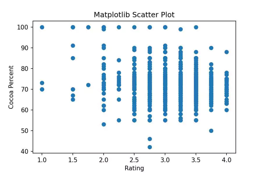
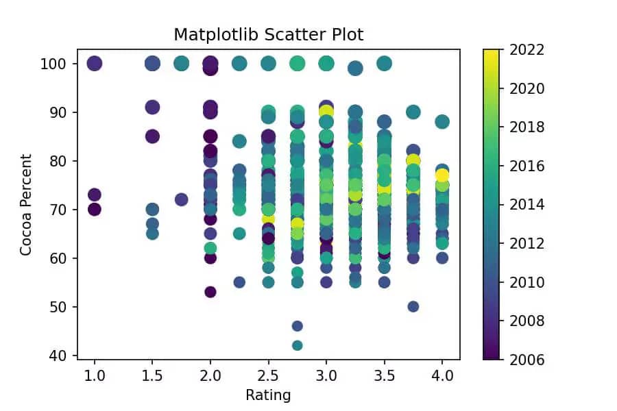
To make this graph more useful we can add color to a scatter plot in Matplotlib. You will need to use the colorbar() method of the Figure object.
This will create a scatter plot with a color bar on the right side of the plot. The color of the dots will be encoded by the values in the c array and the color bar will show the corresponding color scale.
Also, we can change the size of points by using the s parameter respectively of the scatter function.
Here’s an example of how you can create a scatter plot with a color bar using Matplotlib:
import pandas as pd
import matplotlib.pyplot as plt

# reading the database
df = pd.read_csv("chocolate_bar_ratings")

# remove % symbol
df['Cocoa Percent'] = list(map(lambda x: x[:-1], df['Cocoa Percent'].values))

# converting percent into float values
df['Cocoa Percent'] = [float(x) for x in df['Cocoa Percent'].values]

# Scatter plot with ratings againts cocoa percent
plt.scatter( df['Rating'], df['Cocoa Percent'], c = df['Review Date'],
           s = df['Cocoa Percent'])

#Adding Title to the plot
plt.title("Matplotlib Scatter Plot")

#Setting the X and Y labels
plt.xlabel("Rating")
plt.ylabel("Cocoa Percent")

# Showing colorbar
plt.colorbar()

plt.show()
Output –
Matplotlib Line Chart in python
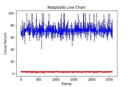
A line chart, also known as a line plot or line graph, is a type of chart used to display data along a number line. Line charts are often used to visualize trends over time or to compare different groups of data.
The line Chart is plotted using the plot() function in the Matplotlib library.
Here’s an example of how you can use Matplotlib to create a line chart:
import pandas as pd
import matplotlib.pyplot as plt

# reading the database
df = pd.read_csv("chocolate_bar_ratings")

# remove % symbol
df['Cocoa Percent'] = list(map(lambda x: x[:-1], df['Cocoa Percent'].values))

# converting percent into float values
df['Cocoa Percent'] = [float(x) for x in df['Cocoa Percent'].values]

# Line plot with ratings againts cocoa percent
plt.plot(df['Rating'],color='red', linewidth=2, linestyle='dashed')
plt.plot(df['Cocoa Percent'], color='blue', linewidth=2, linestyle='dotted')

#Adding Title to the plot
plt.title("Matplotlib Line Chart")

#Setting the X and Y labels
plt.xlabel("Rating")
plt.ylabel("Cocoa Percent")

plt.show()
Output –
Matplotlib supports different line styles which you can choose from the below image.

Matplotlib Bar Chart in python
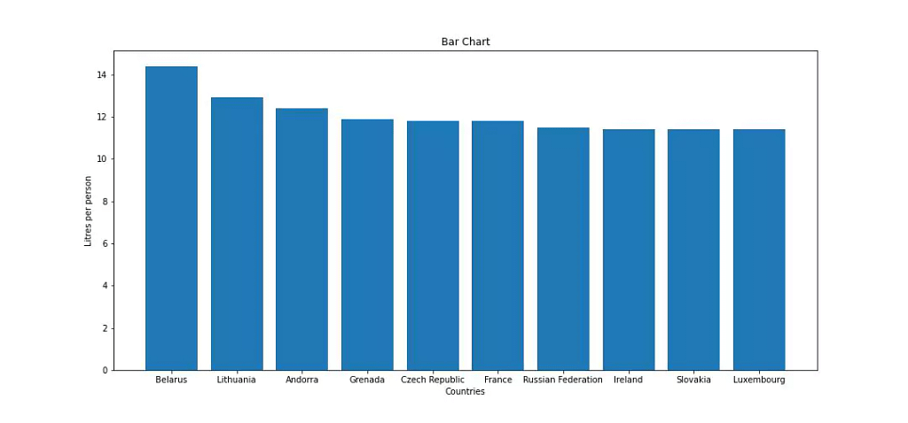
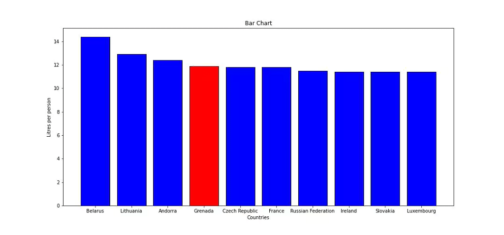
A bar chart, also known as a bar graph, is a type of chart that uses rectangular bars to represent different categories of data and show the relationships between them. The length of the bars represents the values of the data.
We can create bar charts with the help of matplotlib using the bar() method. Here’s an example of how you can use Matplotlib to create a bar chart:
import pandas as pd
import matplotlib.pyplot as plt

# reading the database
df = pd.read_csv("drinks.csv")

# remove % symbol
top10_alcohol = df.sort_values('total_litres_of_pure_alcohol', ascending = False)[:10].reset_index(drop=True)

spirit_top = top10_alcohol['spirit_servings']

fig = plt.figure(figsize = (15, 7))

plt.bar( top10_alcohol['country'], top10_alcohol['total_litres_of_pure_alcohol'])

#Adding Title to the plot
plt.title("Bar Chart")

#Setting the X and Y labels
plt.xlabel("Countries")
plt.ylabel("Litres per person")

plt.show()
Output –
Highlighting some bars
import pandas as pd
import matplotlib.pyplot as plt

# reading the database
df = pd.read_csv("drinks.csv")

# remove % symbol
top10_alcohol = df.sort_values('total_litres_of_pure_alcohol', ascending = False)[:10].reset_index(drop=True)

spirit_top = top10_alcohol['spirit_servings']
colors = ['blue' if (s < max(spirit_top)) else 'red' for s in spirit_top]

fig = plt.figure(figsize = (15, 7))

plt.bar( top10_alcohol['country'], top10_alcohol['total_litres_of_pure_alcohol'],color = colors, edgecolor='black')

#Adding Title to the plot
plt.title("Bar Chart")

#Setting the X and Y labels
plt.xlabel("Countries")
plt.ylabel("Litres per person")

plt.show()
Output –
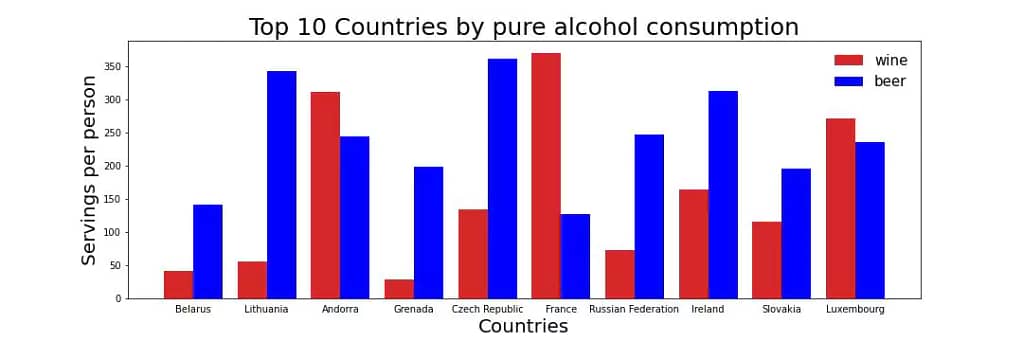
Comparing two different categories
import pandas as pd
import matplotlib.pyplot as plt

# reading the database
df = pd.read_csv("drinks.csv")

fig, ax = plt.subplots(figsize = (15,5))
x = np.arange(len(top10_alcohol))

width = 0.4
plt.bar(x-0.2, top10_alcohol['wine_servings'], width, color = 'tab:red', label = 'wine')
plt.bar(x+0.2, top10_alcohol['beer_servings'], width, color = 'blue', label = 'beer')


plt.title('Top 10 Countries by pure alcohol consumption', fontsize = 25)
plt.xlabel('Countries', fontsize = 20)

#putting country names
plt.xticks(top10_alcohol.index, top10_alcohol['country'], fontsize = 10)

plt.ylabel('Servings per person', fontsize = 20)

#tick params on the left
ax.tick_params(bottom=False, left = True)
plt.legend(frameon=False, fontsize=15)

plt.show()
Output –
Matplotlib Box plot in python
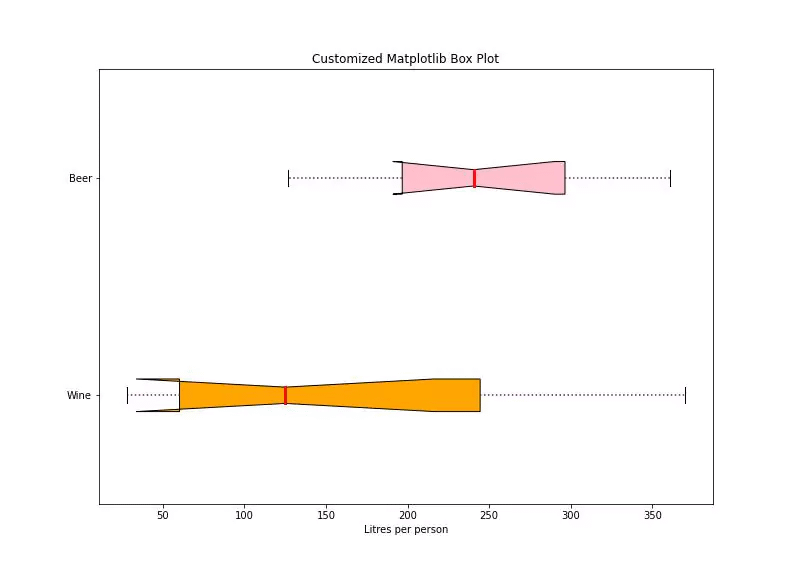
A box plot, also known as a box-and-whisker plot, is a type of chart used to display the distribution of numerical data by showing the median, quartiles, and outliers. Box plots are useful for identifying outliers and understanding the distribution of your data.
The boxplot() function will create a box plot with the box showing the interquartile range (the range between the first and third quartiles), the line inside the box representing the median value, and the dots outside of the box are the outlier points.
Here’s an example of how you can use Matplotlib to create a box plot:
import pandas as pd
import matplotlib.pyplot as plt

# reading the database
df = pd.read_csv("drinks.csv")

top10_alcohol = df.sort_values('total_litres_of_pure_alcohol', ascending = False)[:10].reset_index(drop=True)

data = [top10_alcohol['wine_servings'], top10_alcohol['beer_servings']]

fig = plt.figure(figsize =(11, 8))
ax = fig.add_subplot(111)

# making an axis instance
bp = ax.boxplot(data, patch_artist = True, notch ='True', vert = 0)
colors = ['orange', 'pink','red']

for patch, color in zip(bp['boxes'], colors): patch.set_facecolor(color)

for whisker in bp['whiskers']: whisker.set(color ='#8B008B', linewidth = 1.5, linestyle =":")

# Color and linewidth of medians can be changed.
for median in bp['medians']: median.set(color ='red', linewidth = 3)

for flier in bp['fliers']: flier.set(marker ='D', color ='#e7298a', alpha = 0.5)

ax.set_yticklabels(['Wine', 'Beer'])
plt.xlabel("Litres per person")

# Including a title
plt.title("Customized Box Plot with Labels")

# Ticks on the top and right axes are removed.
ax.get_xaxis().tick_bottom()
ax.get_yaxis().tick_left()

# display the plot
plt.show(bp)
Output –
Matplotlib Pie Chart
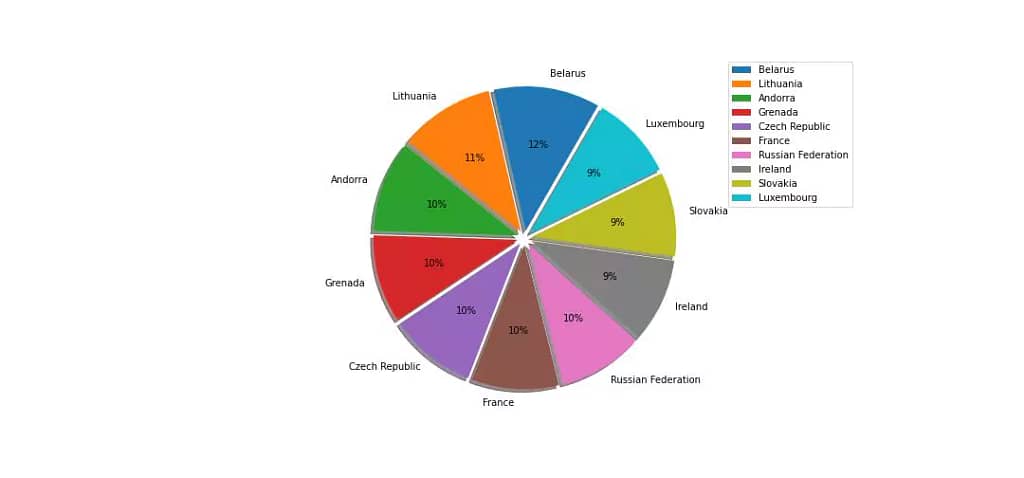
A pie chart, also known as a circular chart or a pie graph, is a type of chart used to display the proportion of different categories in a whole.
It is divided into slices, where each slice represents a category, and the size of the slice represents the proportion of that category to the whole.
Here’s an example of how you can use Matplotlib to create a pie chart:
import pandas as pd
import matplotlib.pyplot as plt

# reading the database
df = pd.read_csv("drinks.csv")

top10_alcohol = df.sort_values('total_litres_of_pure_alcohol', ascending = False)[:10].reset_index(drop=True)

fig = plt.figure(figsize = (15, 7))

explode = (0.05, 0.05, 0.05, 0.05, 0.05,0.05, 0.05, 0.05, 0.05, 0.05)
plt.pie(top10_alcohol['total_litres_of_pure_alcohol'],
        labels= top10_alcohol['country'], shadow=True,
        autopct='%1.0f%%', explode=explode, startangle=60)
plt.legend(bbox_to_anchor = (1.05, 1.0), loc = 'upper left')
plt.show()
Output –
Matplotlib Heatmap
A heatmap is a graphical representation of data where individual values are represented as colors. It’s a great way to visualize data with two or more dimensions, and it’s especially useful for visualizing patterns in a matrix or a table of data.
Here’s an example of how you can use Matplotlib to create a heatmap:
import pandas as pd
import matplotlib.pyplot as plt

# reading the database
df = pd.read_csv("drinks.csv")

top10_alcohol = df.sort_values('total_litres_of_pure_alcohol', ascending = False)[:10].reset_index(drop=True)

fig, ax = plt.subplots()
fig = plt.figure(figsize = (15, 7))

im = ax.imshow(data, cmap = "hot")

# Create colorbar
cbar = ax.figure.colorbar(im, ax=ax)
cbar.ax.set_ylabel(ylabel = "Alcohol Consumtion", rotation=-90, va="bottom")
#
# Show all ticks and label them with the respective list entries
ax.set_xticks(np.arange(len(columns)), labels=columns)
ax.set_yticks(np.arange(len(country)), labels=country)

# Rotate the tick labels and set their alignment.
plt.setp(ax.get_xticklabels(), rotation=45, ha="right",
         rotation_mode="anchor")

# Loop over data dimensions and create text annotations.
for i in range(len(country)):
    for j in range(len(columns)):
        text = ax.text(j, i, data[columns[j]][i],
                       ha="center", va="center", color="w")

ax.set_title("Alcohol consumpution in top 10 countries")
fig.tight_layout()
plt.show()
Output –
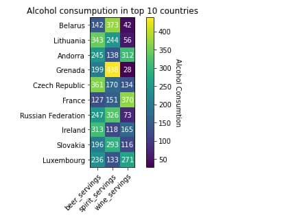
You can also use many other colormaps other than ‘hot’ like ‘cool’,’jet’,’viridis’,’YlGnBu’ etc. You can find more information about colormaps in the Matplotlib documentation. You can also customize the heatmap by adding axis labels and a title and adjusting the appearance of the cells.
Matplotlib Histogram
A histogram is a graphical representation of data that shows the distribution of a set of continuous or discrete data. It’s a useful tool for visualizing the distribution of a dataset and for identifying patterns, outliers, and skewness in the data.
Here’s an example of how you can use Matplotlib to create a histogram:
import pandas as pd
import matplotlib.pyplot as plt

# reading the database
df = pd.read_csv("drinks.csv")

n, bins, patches = plt.hist(x=df['total_litres_of_pure_alcohol'], bins='auto', color='#0504aa',
                            alpha=0.7, rwidth=0.85)

plt.grid(axis='y', alpha=0.75)

plt.xlabel('Liters')
plt.ylabel('Frequency')

fig.tight_layout()

plt.title("Histogram")

maxfreq = n.max()
# Set a clean upper y-axis limit.
plt.ylim(ymax=np.ceil(maxfreq / 10) * 10 if maxfreq % 10 else maxfreq + 10)

plt.show()
Output –
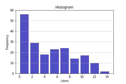
Matplotlib inline invalid syntax
If you’re using a Jupyter notebook and getting an invalid inline syntax error then, just mention this line in the first cell.
In []: %matplotlib inline
Python notebook provides a collection of several predefined functions called magic functions, which can be used and called by command-line style syntax.
Basically, there are two types of magic functions, line-oriented and cell-oriented. You
This syntax works on the Jupyter Notebook.
This is a really good command and works best with Jupiter’s IPython Notebook. It’s basically used to show an image automatically within the browser without using show().
Matplotlib Transparent Background – How to save a transparent plot
When you’re creating plots in Matplotlib, the default background color is white. If you want to save a plot with a transparent background, you can use the savefig() function and set the transparent parameter to True.
Here’s an example of how you can save a plot with a transparent background:
import pandas as pd
import matplotlib.pyplot as plt

# reading the database
df = pd.read_csv("drinks.csv")

n, bins, patches = plt.hist(x=df['total_litres_of_pure_alcohol'], bins='auto', color='#0504aa',
                            alpha=0.7, rwidth=0.85)

plt.grid(axis='y', alpha=0.75)

plt.xlabel('Liters')
plt.ylabel('Frequency')

fig.tight_layout()

plt.title("Histogram")

maxfreq = n.max()
# Set a clean upper y-axis limit.
plt.ylim(ymax=np.ceil(maxfreq / 10) * 10 if maxfreq % 10 else maxfreq + 10)

plt.savefig('histogram_example.png', transparent=True)
This will save the plot as a PNG image with a transparent background. You can also use other image formats like ‘svg’, ‘jpg’ etc by changing the format to the appropriate extension.
I encountered a Matplotlib Crash Course on YouTube which can also help you to learn the basics of matplotlib.
Seaborn vs Matplotlib
Seaborn and Matplotlib are both powerful libraries for creating data visualizations in Python. However, they have some key differences.
Matplotlib is a low-level library for creating plots and figures, and it provides a lot of control over the appearance of the plots. It is widely used to create plots of all types, from simple line plots to complex 3D plots. However, the process of creating plots with Matplotlib can be verbose and time-consuming.
Seaborn, on the other hand, is built on top of Matplotlib and provides a higher-level interface for creating plots. It is designed to make it easy to create beautiful, informative, and easy-to-read statistical graphics, and it provides many built-in functions for creating common plot types. With Seaborn, you can create a complex plot with just a few lines of code, and it also provides a way to change the style and color palette of the plots.
Here are some key differences between Seaborn and Matplotlib:
- Matplotlib is a low-level library with a lot of flexibility, while Seaborn is a higher-level library that is easier to use.
- Matplotlib is great for creating all types of plots, but creating plots with Seaborn is often quicker and easier.
- Seaborn includes many built-in functions for creating common plot types, while Matplotlib requires you to write more code to create the same plots.
- Seaborn also has more advanced features for working with statistical data, such as built-in support for linear regression and kernel density estimation.
- Seaborn has a lot more options for color palettes and changing the themes of the plots.
In most cases, Seaborn is preferred over Matplotlib when it comes to creating visualizations for statistical data, as it provides a more concise, higher-level interface that makes it easy to create good-looking plots quickly. However, if you require more control over the appearance of the plots or need to create custom plot types, you may want to use Matplotlib.
Visualization With Seaborn
Seaborn is a powerful Python library for data visualization that is built on top of Matplotlib. It makes it easy to create beautiful, informative, and easy-to-read statistical graphics, while also providing a higher-level API for creating complex visualizations.
One of the main benefits of Seaborn is its ability to create highly-customizable visualizations with a simple API.
seaborn python install
You can use pip to install Seaborn by running the following command in your terminal:
pip install seaborn

Seaborn Scatter Plot in python
Seaborn is a powerful library for creating data visualizations in Python and it offers a convenient way to create scatter plots. Scatter plots are used to visualize the relationship between two variables in a dataset.
Here’s an example of how you can create a scatter plot with Seaborn:
import seaborn as sns
import matplotlib.pyplot as plt

# Load a data set
tips = sns.load_dataset("tips")

# Create a scatter plot
sns.scatterplot(x="total_bill", y="tip", data=tips)

#Adding Title to the plot
plt.title("Seaborn Scatter Plot")

#Setting the X and Y labels
plt.xlabel("total bill")
plt.ylabel("tip")

# Show the plot
plt.show()
This will create a scatter plot of the total_bill and tip columns from the tips data set.
Output –
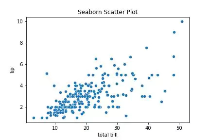
Seaborn automatically selects a color palette for the plot, but you can also pass in your own color palette by specifying the color parameter.
You can also customize the plot by adding additional elements such as regression lines and confidence intervals by adding the regplot() method and set the ci parameter :
import seaborn as sns
import matplotlib.pyplot as plt

# Load a data set
tips = sns.load_dataset("tips")

# Create a scatter plot with a linear regression line
sns.regplot(x="total_bill", y="tip", data=tips, ci = 68)

#Adding Title to the plot
plt.title("Seaborn Scatter Plot")

#Setting the X and Y labels
plt.xlabel("total bill")
plt.ylabel("tip")

# Show the plot
plt.show()
Output –
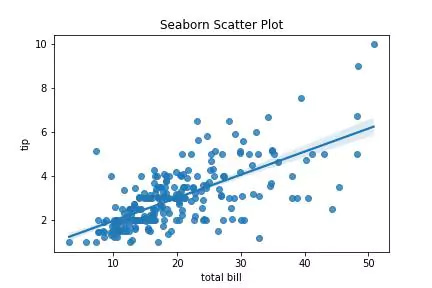
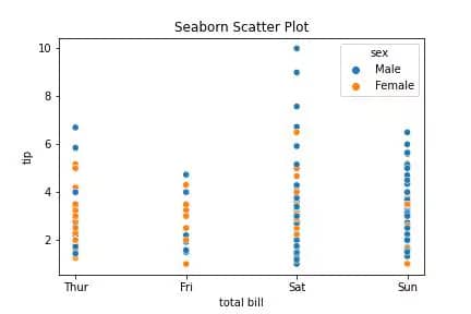
In matplotlib it was a lot more difficult to color each point but in seaborn, we can easily do it using the hue argument.
Here’s an example of how you can color each point with Seaborn:
import seaborn as sns
import matplotlib.pyplot as plt

# Load a data set
tips = sns.load_dataset("tips")

# Create a scatter plot
sns.scatterplot(x="day", y="tip", data=tips, hue = 'sex')

#Adding Title to the plot
plt.title("Seaborn Scatter Plot")

#Setting the X and Y labels
plt.xlabel("total bill")
plt.ylabel("tip")

# Show the plot
plt.show()
Output –
Seaborn Line Plot in python
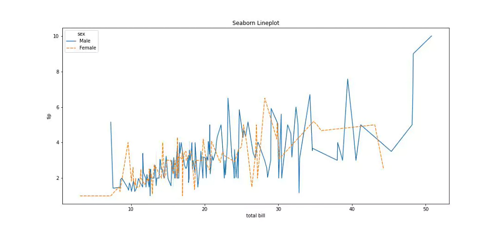
Seaborn is a Python library for creating statistical graphics, and one of the functions it provides is the lineplot() function, which is used to create line plots. The basic syntax for creating a line plot with Seaborn is as follows:
sns.lineplot(x=x_data, y=y_data, data=data)
Where x_data and y_data are the names of the columns in the data DataFrame contains the x and y data, respectively. The data parameter is optional and can be omitted if the x and y data are included in the same data frame.
For example, consider the following DataFrame named df with two columns named x and y, representing data of x and y, you can create a line plot with the following code:
You can customize the appearance of the line plot by using the various other optional parameters that the lineplot() the function provides, such as hue, style, size, etc.
import seaborn as sns
import matplotlib.pyplot as plt

# Load a data set
tips = sns.load_dataset("tips")

# Create a scatter plot with a linear regression line
sns.regplot(x="total_bill", y="tip", data=tips, ci = 68)

#Adding Title to the plot
plt.title("Seaborn Scatter Plot")

#Setting the X and Y labels
plt.xlabel("total bill")
plt.ylabel("tip")

# Show the plot
plt.show()
Output –
Seaborn Bar Chart/ Bar plot in python
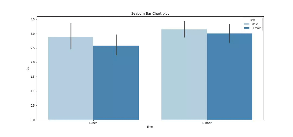
Seaborn provides the barplot() function for creating bar charts, also known as bar plots. The basic syntax for creating a bar plot with Seaborn is as follows:
sns.barplot(x=x_data, y=y_data, data=data)
Where x_data and y_data are the names of the columns in the data DataFrame contains the x and y data, respectively. x_data is used to label the x-axis and y_data is used to determine the height of the bars.
The data parameter is optional and can be omitted if the x and y data are included in the same data frame.
For example, consider the following DataFrame named tips with two columns named “time” and “tips”, representing data of x and y, you can create a bar plot with the following code:
import seaborn as sns
import matplotlib.pyplot as plt

# Load a data set
tips = sns.load_dataset("tips")

plt.figure(figsize = (15, 7))

# Create a line plot
sns.barplot(x="time",
            y="tip",
            hue="sex",
            palette = "Blues",
            data=tips)

#Adding Title to the plot
plt.title("Seaborn Bar Chart plot")

#Setting the X and Y labels
plt.xlabel("time")
plt.ylabel("tip")

# Show the plot
plt.show()
Also, you could customize the appearance of the bar plot using various other optional parameters like hue, ci, order, etc. It allows to representation of the data in different ways.
Output –
Seaborn Histogram in python
Seaborn provides histplot() function for creating histograms, which can also be used to fit probability distributions to the data and plot the estimated density.
You can create a histogram with the following code:
import seaborn as sns
import matplotlib.pyplot as plt

# Load a data set
tips = sns.load_dataset("tips")

plt.figure(figsize = (15, 7))

# Create a line plot
sns.histplot(data=tips,
           x = "total_bill",
            kde = True,
             bins ="auto",
            hue = "sex")

#Adding Title to the plot
plt.title("Seaborn Bar Chart plot")

# Show the plot
plt.show()
Also, you could set the number of bins using the bins parameter. The default is auto, which uses the Freedman-Diaconis rule to determine the number of bins.
Output –
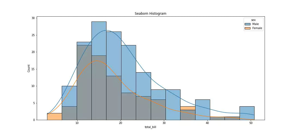
You can also change the color of the plot, or the transparency of the bars, as well as the line width of the curve.
Seaborn(SNS) Heatmap
Seaborn provides the heatmap() function for creating heatmaps, which are graphical representations of data where individual values are represented as colors.
The basic syntax for creating a heatmap with Seaborn is as follows:
sns.heatmap(data, cmap='cmap_name')
where data is a 2D array or a DataFrame containing the data to be plotted, and cmap is a string specifying the name of the colormap to use.
The default colormap is "viridis", but you can use any of the colormaps provided by Matplotlib.
For example, consider the following DataFrame named tips representing some data, you can create a heatmap with the following code:
import seaborn as sns
import matplotlib.pyplot as plt

# Load a data set
tips = sns.load_dataset("tips")

top10_tips = tips.sort_values("tip", ascending = False)[:10].reset_index(drop=True)

data = top10_tips[['total_bill','tip','size']]

plt.figure(figsize = (15, 7))

# Create a line plot
sns.heatmap(data=data,cmap = "viridis",
           annot = True)

#Adding Title to the plot
plt.title("Seaborn Heatmap")

# Show the plot
plt.show()
Output –
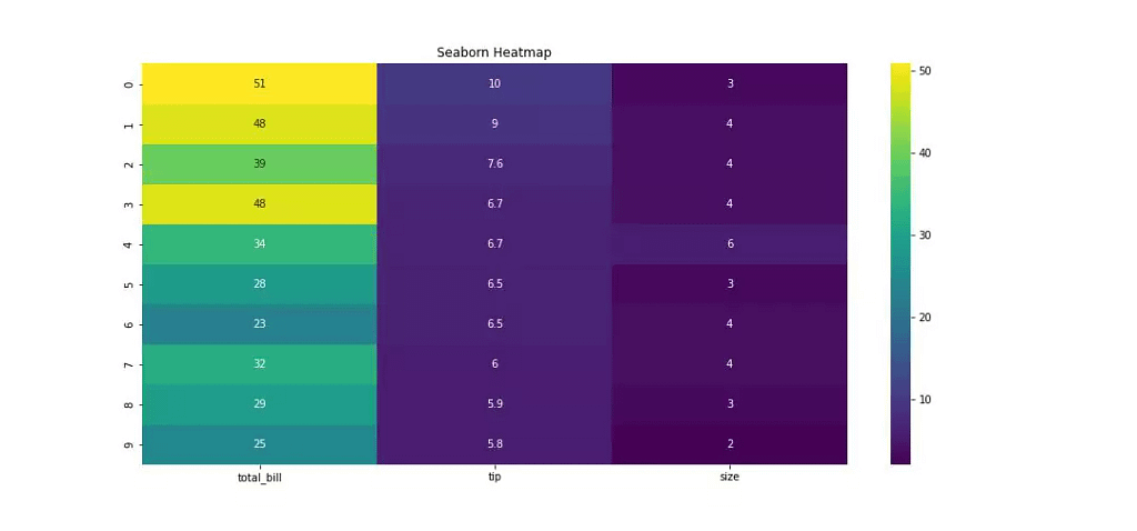
Also, you could customize the appearance of the heatmap by using various optional parameters, such as annot, fmt, linewidths, cbar_kws, etc. You can control the appearance of the colorbar like its position or the format of the ticks. You can also hide some of the axis labels or change their font size.
sns.heatmap(df, cmap='YlGnBu', annot=True, fmt='.2f', cbar=True, cbar_kws={'label': 'Value'})Output –
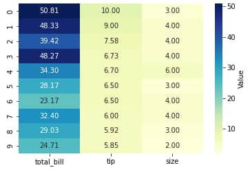
You can also use the annotate function in the heatmap to make a data-informed annotation to the heatmap, using data-informed labels.
Seaborn also provides other functions such as clustermap for the representation of heatmap with hierarchical clustering.
sns.clustermap(df, cmap='YlGnBu')
It will give a heatmap with row and column dendrograms.
Output –
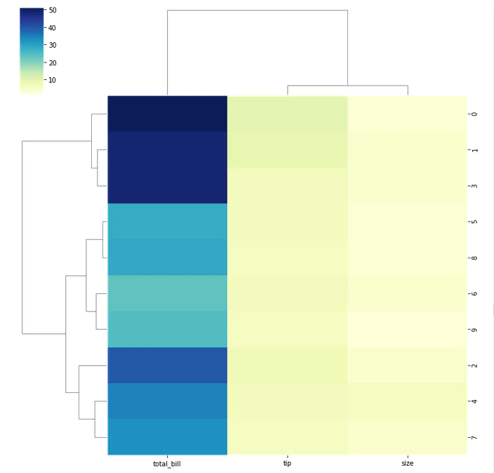
It is also possible to represent a heatmap of data with different types like categorical variables, or ordinal variables, by using the categorical heatmap, diverging heatmap, etc.
confusion matrix seaborn
A confusion matrix is a table that is used to define the performance of a classification algorithm. A confusion matrix in seaborn can be easily plotted using the heatmap() function, where the data is formatted as a matrix, and the color scheme represents the different levels of classification accuracy.
Here is an example of creating a confusion matrix using Seaborn:
import seaborn as sns

# y_true is the list of true labels
# y_pred is the list of predicted labels
conf_mat = confusion_matrix(y_true, y_pred)
sns.heatmap(conf_mat, annot=True, fmt='d',
            xticklabels=class_labels, yticklabels=class_labels)
Here, conf_mat is the confusion matrix, obtained from the true labels y_true and the predicted labels y_pred.
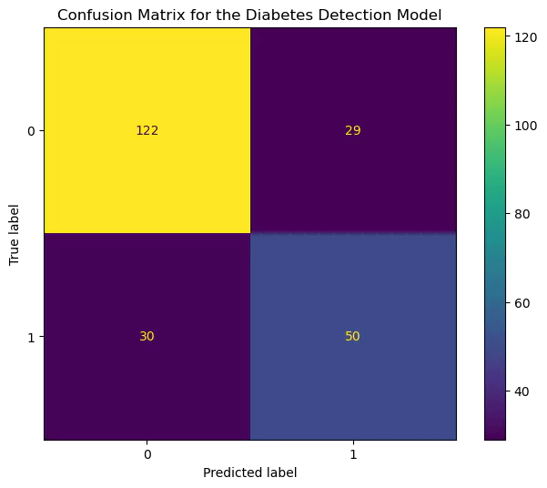
The parameter annot=True adds the counts of correct and incorrect predictions inside the matrix cells, the fmt='d' format specifier specifies that the counts are integers. xticklabels and yticklabels set the x-axis and y-axis labels respectively which correspond to the class labels in our case.
Seaborn Distplot
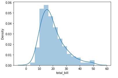
The distplot() function in the Seaborn library is used to create a histogram, a kernel density estimate (KDE), and a rug plot all in one. By default, distplot() creates a histogram with a KDE overlaid on top, but you can customize the appearance of the plot by using various optional parameters.
The basic syntax for creating a distplot with Seaborn is as follows:
sns.distplot(data)
where data is a column of a dataframe or an array containing the data.
For example, consider the following DataFrame named df with a column named x representing some data, you can create a distplot with the following code:
import seaborn as sns
sns.distplot(tips['total_bill']);
Output –
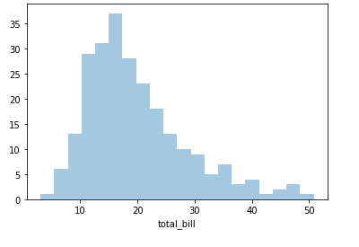
You can turn off the KDE component with kde=False , and you can control the number of bins in the histogram with the bins parameter.
sns.distplot(df['x'], kde=False, bins=20)
Output –
You can use hist parameter to change the appearance of the histogram, like hist=False to turn off the hist component.
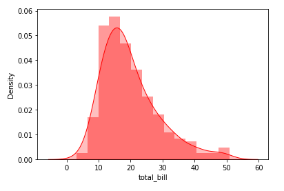
You could change the appearance of KDE by using kde_kws parameter, such as kde_kws={'shade': True}, or change the color of the KDE line by using color='red'.
sns.distplot(df['x'], kde_kws={'shade': True}, color='red')Output –
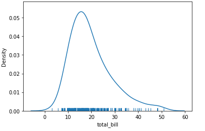
You could also use rug parameters to show a rug plot instead of a histogram, to show a rug plot of the observations.
sns.distplot(df['x'], hist=False, rug=True)
Output –
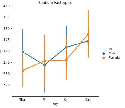
Seaborn Factorplot
Seaborn’s factorplot() is a versatile function that allows you to create different types of plots based on the “factors” in the data.
A factor is a categorical variable, and factorplot() allows you to create plots that show the relationship between one or more factors and a continuous variable.
The basic syntax for creating a factorplot with Seaborn is as follows:
sns.factorplot(x=x_factor, y=y_variable, data=data)
Where x_factor and y_variable are the names of the columns in the data DataFrame that contains the x-factor and y-variable respectively. The data parameter is optional and can be omitted if the x-factor and y-variable are included in the same DataFrame.
For example, consider the following DataFrame named tips with columns named day and tip representing some data, you can create a factorplot with the following code:
import seaborn as sns
import matplotlib.pyplot as plt

# Load a data set
tips = sns.load_dataset("tips")

plt.figure(figsize = (15, 7))

# Create a factorplot plot
sns.factorplot(x="day",
               y = 'tip',
               data = tips,
               hue = 'sex',
               cmap = "viridis")

#Adding Title to the plot
plt.title("Seaborn Heatmap")

# Show the plot
plt.show()
Output –
Seaborn Box Plot
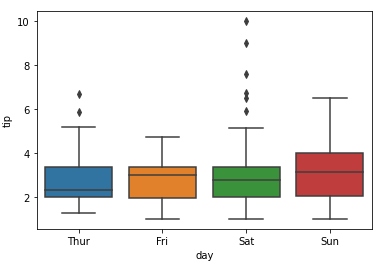
Seaborn’s boxplot() the function is used to create box plots, which are a way of representing the distribution of a set of data through its quartiles. The basic syntax for creating a box plot with Seaborn is as follows:
sns.boxplot(x=x_data, y=y_data, data=data)
Where x_data and y_data are the names of the columns in the data DataFrame contains the x and y data, respectively. The data the parameter is optional and can be omitted if the x and y data are included in the same DataFrame.
For example, consider the following DataFrame named df with two columns named day and tip, representing data of x and y, you can create a boxplot with the following code:
import seaborn as sns

# Load a data set
tips = sns.load_dataset("tips")

sns.boxplot(x='day', y='tip', data=tips)
Output –
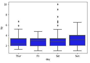
You can also customize the appearance of the box plot by using various other optional parameters such as color, linewidth, etc.
import seaborn as sns

# Load a data set
tips = sns.load_dataset("tips")

sns.boxplot(x='day', y='tip', data=tips, color='blue', linewidth=2)
Output –
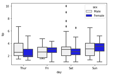
You could also use another method such as catplot which is a more general version of boxplot and allows more flexibility in representing data.
You could also show the observations, not just the boxes, using the swarm parameter, and also could use hue the parameter to represent the relationship between multiple variables.
import seaborn as sns

# Load a data set
tips = sns.load_dataset("tips")

sns.boxplot(x='day',
            y='tip',
            hue='sex',
            data=tips,
            color='blue',
            linewidth=2,
            whis=2,
            dodge=True)
Output –
It’s also possible to represent boxplot for multiple variables with violinplot and boxenplot to represent the data in different ways.
boxplot has been deprecated in the recent version of seaborn, the recommendation is to use catplot(kind='box') in replacement for it.
It is important to note that boxplot() is used to summarize the distribution of a continuous variable, and in some cases might not be the best visual representation of the data. Depending on the distribution of the data, boxplots can make it difficult to see details and outliers, In these cases, It is recommended to use another type of plot like a violin plot or swarm plot.
Seaborn Pie Chart
Like Matplotlib, Seaborn also has support for creating pie charts.
import matplotlib.pyplot as plt
import seaborn as sns

#define data
data = [55, 45, 15, 85, 35]
labels = ['Group 1', 'Group 2', 'Group 3', 'Group 4', 'Group 5']

#define Seaborn color palette to use
colors = sns.color_palette('pastel')[0:5]

#create pie chart
plt.pie(data,
        labels = labels,
        colors = colors,
        autopct='%.0f%%',
       shadow = True)

sns.set()
plt.show()
Output –
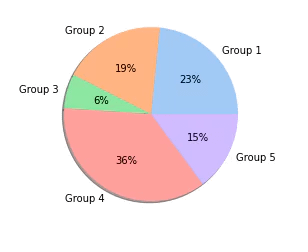
However, there are many more styles you could use. Refer to the online documentation for a complete list of color palettes.
Seaborn Transparent Background – How to save a seaborn plot
When you’re creating plots in Seaborn, by default, the background color is white. If you want to save a plot with a transparent background in Seaborn by adding the ‘alpha’ parameter to any of the plotting function you use, like in this example:
import seaborn as sns
import matplotlib.pyplot as plt

# Load a data set
tips = sns.load_dataset("tips")

fig = plt.figure()
fig.patch.set_alpha(0.7)

# Create a scatter plot with a linear regression line
sns.regplot(x="total_bill", y="tip", data=tips, ci = 68)

#Adding Title to the plot
plt.title("Seaborn Scatter Plot")

#Setting the X and Y labels
plt.xlabel("total bill")
plt.ylabel("tip")

fig.savefig('scatter example output', transparent=True)
# Show the plot
plt.show()
It makes the scatterplot alpha transparent and you can also save the plot using the savefig() function.
Output –
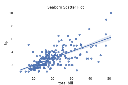
Keep in mind that if you’re going to overlay the image on top of other elements, it’s important to make sure that the background color of the elements is set to match the transparent background, or it will not blend correctly.
You can check this seaborn scatter plot playlist on youtube.
Visualization with Plotly
Plotly is a Python library for creating interactive, web-based visualizations. It is built on top of the popular visualization library matplotlib and offers a wide range of options for creating different types of plots, including scatter plots, line plots, bar plots, and heatmaps, among others.
Plotly’s syntax for creating plots is similar to that of matplotlib, but it also includes additional functionality for creating interactive elements, such as hover text and buttons.
plotly python install
To install Plotly in Python, you can use the pip package manager by running the following command in your terminal or command prompt:
pip install plotly
Scatter Plot in Plotly
Scatter plots are a way to visualize the relationship between two variables and can be easily created in Plotly using the scatter() function from the express module.
Here is an example of creating a scatter plot using Plotly:
import plotly.express as px

# Load tips data set
tips_df = px.data.tips()

# Create a scatter plot
fig = px.scatter(tips_df, x="total_bill", y="tip")

fig.show()
Output –
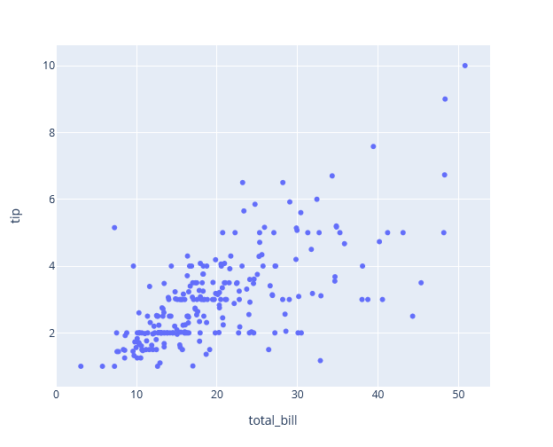
In this example, “total_bill” and “tip” are the data that are plotted on the x and y axes
Changing color in scatter plot in Plotly
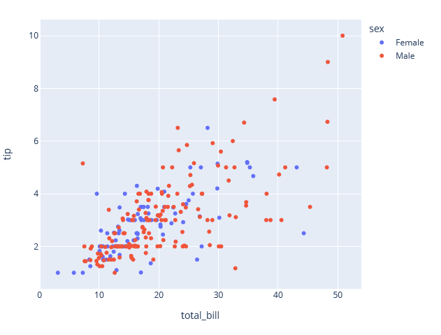
In scatter() function we can pass an argument color using which we can change the color of dots in the scatter plot.
In the below example, we are separating the dots based on male and female.
import plotly.express as px

# Load tips data set
tips_df = px.data.tips()

# Create a scatter plot
fig = px.scatter(tips_df,
                 x="total_bill",
                 y="tip",
                color="sex")

fig.show()
Output –
Customize scatter plot in Plotly
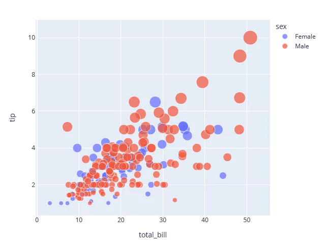
We can also customize the scatter plot by changing the size of dots using the size arguments of the scatter() method.
import plotly.express as px

# Load tips data set
tips_df = px.data.tips()

# Create a scatter plot
fig = px.scatter(tips_df,
                 x="total_bill",
                 y="tip",
                color="sex",
                size = "tip",
                hover_data = ['size'])

fig.show()
Output –
3D Scatter Plot in Plotly
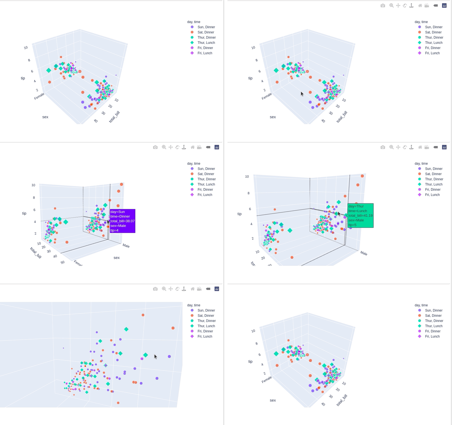
A 3D scatter plot is a type of plot that is used to visualize data points in three-dimensional space. It is similar to a 2D scatter plot, but it has an additional dimension, the z-axis, that represents the third variable. 3D scatter plots are useful for visualizing data with multiple variables and for identifying patterns or trends in the data that may not be apparent in a 2D plot.
You can create a 3D scatter plot in Plotly using the plotly.express module. To create a 3D scatter plot, you need to create a scatter trace, which is a dictionary containing the data for the plot, as well as various other properties such as the color and size of the markers. You can use the show() method to display the graph.
Here is an example of how you can create a 3D scatter plot in Plotly:
import plotly.express as px

# Load tips data set
tips_df = px.data.tips()

# Create a scatter plot
fig = px.scatter_3d(tips_df,
                 x = "total_bill",
                 y = "sex",
                 z = "tip",
                 day = "day",
                 size = "total_bill",
                 symbol = "time")

fig.show()
Output –
Line Plot in Plotly
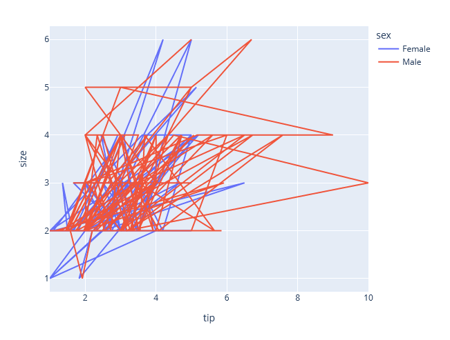
A scatter plot in Plotly is a type of plot that displays individual data points on a two-dimensional graph, with one axis for the x-coordinate and one axis for the y-coordinate.
Each point is represented by a marker, which can be a dot, a circle, or a variety of other shapes. Scatter plots can be used to show the relationship between two variables, and are commonly used in data visualization to explore and analyze data.
Here is an example of how you can create a simple scatter plot in Plotly:
import plotly.express as px

# Load tips data set
tips_df = px.data.tips()

# Create a scatter plot
fig = px.line(tips_df,
                 x="tip",
                 y="size",
                color="sex",
                hover_data = ['size'])

fig.show()
Output –
Bar Chart in Plotly
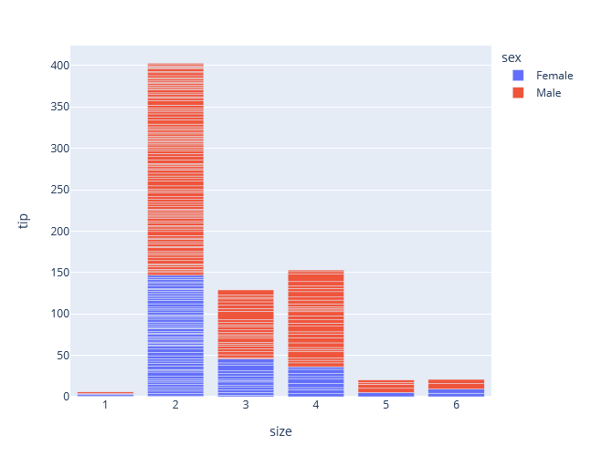
A bar chart, also known as a bar plot or bar graph, is a chart that displays data using rectangular bars, with the length of the bar representing the value of the data point.
Bar charts are commonly used to compare the values of different data points or to show how a single data point changes over time.
To create a bar chart, you need to create a bar trace, which is a dictionary containing the x and y data for the chart, as well as various other properties such as the bar width and color. You then add the trace to a Figure object, which is the main container for all Plotly plots, and use the show() method to display the chart.
Here is an example of how you can create a bar chart in Plotly:
import plotly.express as px

# Load tips data set
tips_df = px.data.tips()

# Create a Bar Chart plot
fig = px.bar(tips_df,
                 x="size",
                 y="tip",
                color="sex")

# Showing the plot
fig.show()
Output –
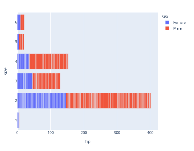
This will create the same bar chart but with Title, x and y-axis labels, Marker color, and line color change. To change the orientation to horizontal bars, use orientation attribute as ‘h’.
# Create a Bar Chart plot
fig = px.bar(tips_df,
                 x="tip",
                 y="size",
                color="sex",
             orientation='h')
Output –
Histogram in Plotly
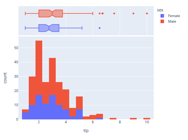
A histogram is a type of graph that is used to represent the distribution of a set of continuous or discrete data points. It is similar to a bar chart, but instead of showing the frequency of individual data points, it shows the frequency of ranges of data points, called bins, that fall within a certain range of values.
Histograms are useful for visualizing the distribution of a dataset and identifying patterns or outliers in the data.
Here is an example of how you can create a histogram in Plotly:
import plotly.express as px

# Load tips data set
tips_df = px.data.tips()

# Create a Bar Chart plot
fig = px.histogram(tips_df,
                 x="tip",
                color="sex", marginal = 'box')

# Showing the plot
fig.show()
Output –
Heatmap in Plotly
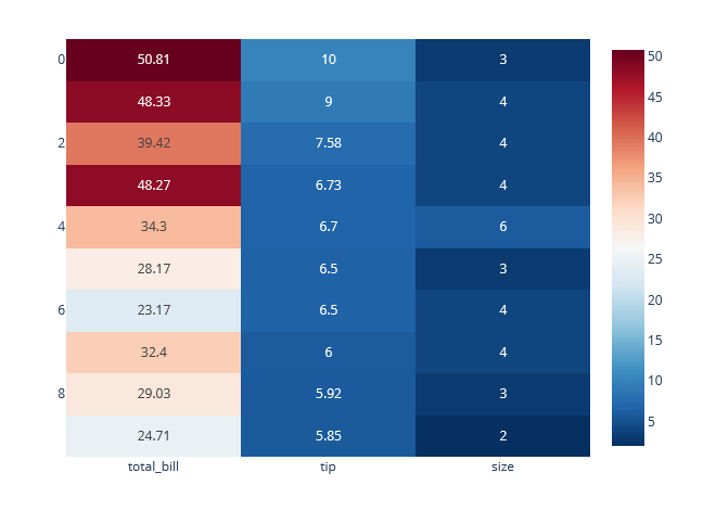
You can create a heatmap in Plotly using the plotly.express module. To create a heatmap, you need to use imshow, as well as various other properties such as the aspect and color_continuous_scale.
Here is an example of how you can create a heatmap in Plotly:
import plotly.express as px

# Load a data set
tips_df = px.data.tips()

top10_tips = tips_df.sort_values("tip", ascending = False)[:10].reset_index(drop=True)

data = top10_tips[['total_bill','tip','size']]


# Create a line plot
fig = px.imshow(data,
                text_auto=True,
                aspect="auto",
                color_continuous_scale='RdBu_r')

fig.show()
Output –
Pie Chart in Plotly
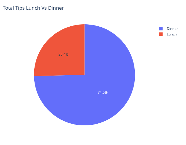
A pie chart is a type of graph that is used to represent the proportion of different parts of a whole. It is represented by a circle divided into segments, with each segment representing a proportion of the whole and the angle of the segment representing the size of the proportion.
Pie charts are useful for visualizing data that represents a part-to-whole relationship, such as the breakdown of a budget or the market share of different companies.
Here is an example of how you can create a pie chart in Plotly:
import plotly.express as px

# Load tips data set
tips_df = px.data.tips()

# Create a Bar Chart plot
fig = px.pie(tips_df,
             values='tip',
             names = 'time',
             title = 'Total Tips Lunch Vs Dinner '
             )

# Showing the plot
fig.show()
Output –
Adding interaction to the plotly plot
Plotly offers a variety of ways to add interactive elements to your plots, such as hover information, zooming, and panning. These interactive features can be added to your plots using the update_layout and update_traces methods in the plotly.graph_objects module.
Plotly also provides a wide range of tools that can be added to your plots to enhance their interactivity. These include:
- Dropdown menus: You can add dropdown menus to your plots to allow users to select different data sets, views, or other options. The
updatemenusproperty in thelayoutdictionary can be used to create and customize dropdown menus. - Buttons: You can add buttons to your plots to allow users to perform specific actions, such as resetting the plot to its original state or switching between different data sets. The
buttonsproperty in thelayoutdictionary can be used to create and customize buttons. - Sliders: You can add sliders to your plots to allow users to adjust the range of data being displayed, or to control other aspects of the plot. The
slidersproperty in thelayoutdictionary can be used to create and customize sliders. - Radio buttons: You can add radio buttons to your plots to allow users to select from a group of mutually exclusive options. The
radiobuttonsproperty in thelayoutdictionary can be used to create and customize radio buttons. - Text input: You can add text input fields to your plots to allow users to enter text or numerical values. The
textinputproperty in thelayoutdictionary can be used to create and customize text input fields.
All these tools can be added and customized to suit your specific use case and provide a more engaging and interactive experience for your users.
Dropdown Menu in the Plotly
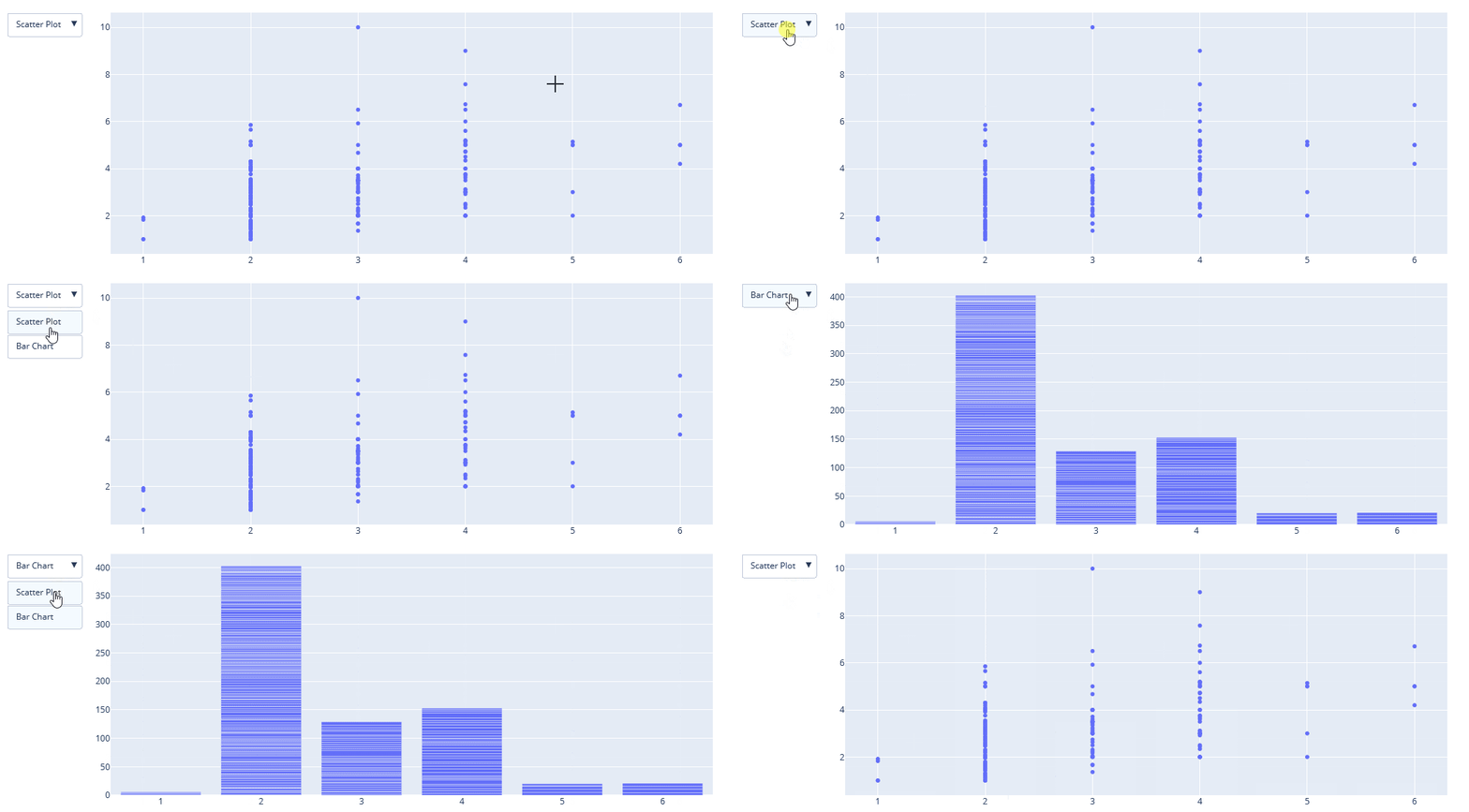
A dropdown menu is a useful tool that allows users to select from a list of options. In Plotly, you can add a dropdown menu to your plots using the updatemenus property in the layout dictionary.
In plotly, there are 4 possible methods to modify the charts by using update menu method.
- restyle: modify data or data attributes
- relayout: modify layout attributes
- update: modify data and layout attributes
- animate: start or pause an animation
Here is an example of how you can add a dropdown menu to a scatter plot:
import plotly.graph_objects as go
import plotly.express as px
import numpy as np
import pandas as pd

# Load tips data set
tips_df = px.data.tips()

plot = go.Figure(data = [go.Scatter(
    x=tips_df['size'],
    y=tips_df['tip'],
    mode='markers')
])

# Add dropdown
plot.update_layout(
    updatemenus=[
        dict(buttons=list([
            dict(
                args=["type", "scatter"],
                label="Scatter Plot",
                method="restyle"
            ),
            dict(
                args=["type", "bar"],
                label="Bar Chart",
                method="restyle"
            )
        ]),
            direction="down",
        ),
    ]
)

plot.show()
Output –
Addin Buttons in the Plotly
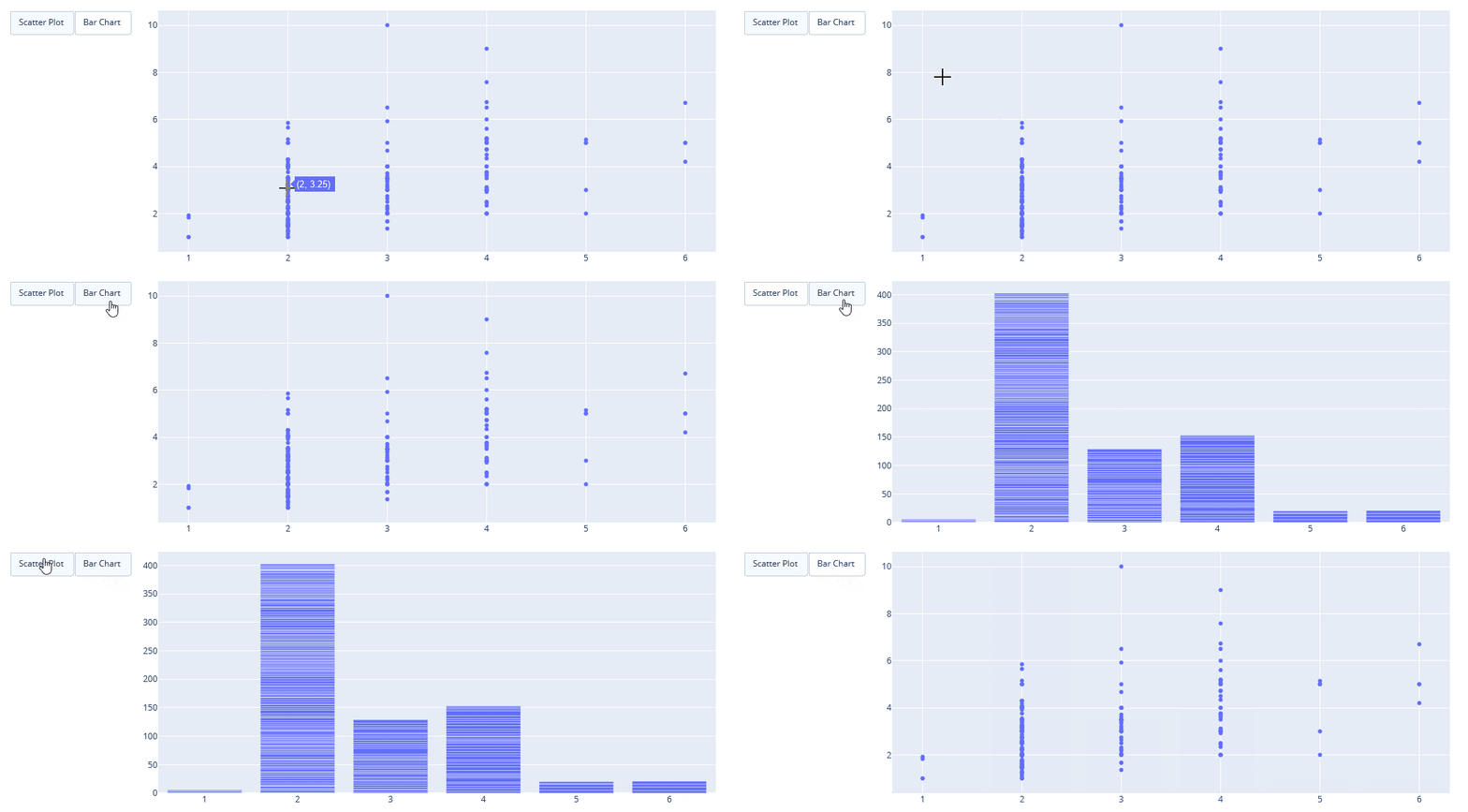
Buttons are a useful tool that allows users to perform specific actions, such as resetting the plot to its original state or switching between different data sets. In Plotly, you can add buttons to your plots using the buttons property in the layout dictionary.
Here is an example of how you can add a button to a plot:
import plotly.graph_objects as go
import plotly.express as px
import numpy as np
import pandas as pd

# Load tips data set
tips_df = px.data.tips()

plot = go.Figure(data = [go.Scatter(
    x=tips_df['size'],
    y=tips_df['tip'],
    mode='markers')
])

# Add Buttons
plot.update_layout(
    updatemenus=[
        dict(
            type="buttons",
            direction="left",
            buttons=list([
                dict(
                    args=["type", "scatter"],
                    label="Scatter Plot",
                    method="restyle"
                ),
                dict(
                    args=["type", "bar"],
                    label="Bar Chart",
                    method="restyle"
                )
            ]),
        ),
    ]
)

plot.show()
Output –
Creating Sliders and Selectors in the Plotly
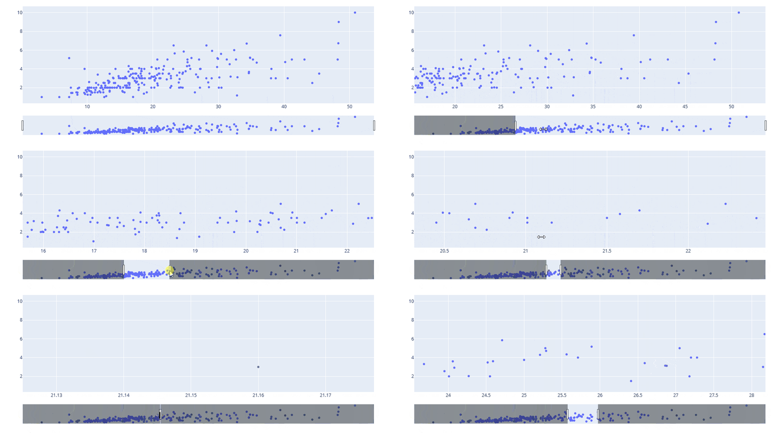
Sliders and selectors are interactive tools that allow users to adjust the range of data being displayed or to select specific data points on a plot. In Plotly, you can create sliders and selectors using the rangeslider and update_layout properties in the layout dictionary, respectively.
Here is an example of how you can create a slider to control the range of data being displayed on a scatter plot:
Output –
Still, if you need a demonstration of each plotly visualizations you can watch the below youtube video.
Conclusion
In conclusion, this blog discussed the importance of data visualization in understanding and interpreting data and introduced three powerful Python libraries, Matplotlib, Plotly, and Seaborn, for creating data visualizations.
The article provided examples of how to create various types of charts such as scatter plots, bar charts, histograms, heatmaps, and pie charts with Matplotlib, Plotly, and Seaborn library.
It also showed how these libraries can be used to customize the appearance of the charts, including adding titles, and labels, changing colors, sizes, and many other attributes.
The article demonstrated that by using these libraries, creating informative and attractive data visualizations is quick and easy.
The goal of the blog is to provide the reader with a good understanding of the power and capabilities of data visualization using Matplotlib, Plotly, and Seaborn, and hopefully, the readers learned something new about data visualization in Python.
Thank you so much for reading the article. 😇
So.. What Do You Think?
Now I want to hear from you.
What do you think of this list?
Or maybe I missed one of your favorite tools.
Either way, let me know by leaving a comment below.


